Verdant - Soil to Table Experience
Art Direction
Branding
Brand System
UI/UX
Copywriting
Logo
Naming
Product Design
Challenge
Design a modern, refined, and eccentric brand identity for an urban community garden that empowers young adults to embrace accessible gardening while fostering connection and education. The identity should reflect the garden’s role as a hub for networking and learning, appealing to a demographic seeking mentorship and community. Through sleek visuals, vibrant yet sophisticated colors, and versatile applications, the brand must convey gardening’s adaptability to urban lifestyles while inspiring trust and excitement in its mission.
Design Approach
The branding balances playful and profound elements, using bold graphic design to evoke the themes of growth and nature reclaiming urban spaces.
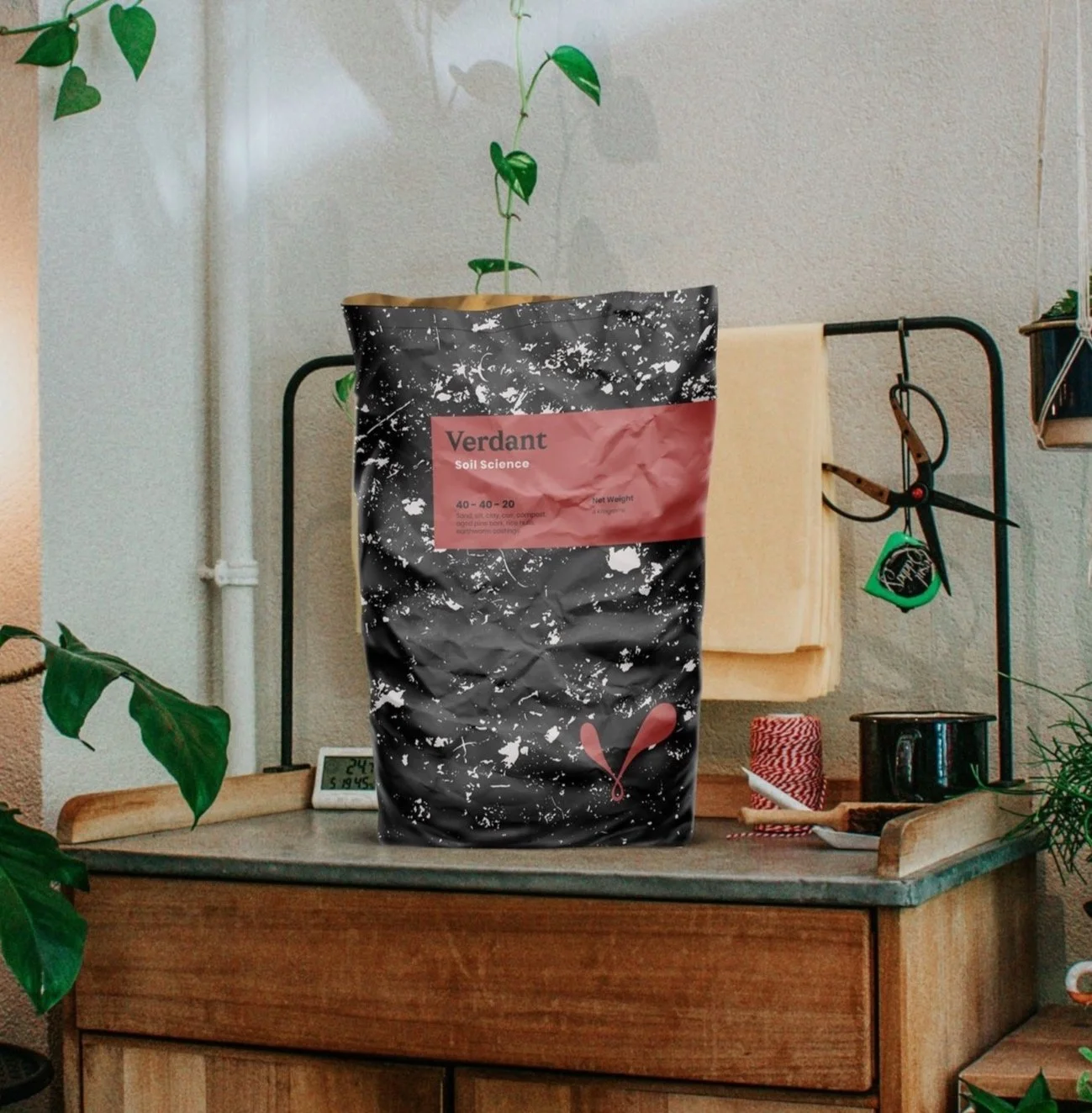
The Verdant logo features an abstract fingerprint that symbolizes a "green thumb" while subtly resembling the letter V, capturing the essence of growth, sustainability, and the hands-on journey from soil to table. The logo typefaces reflect urban resilience and nature’s revival, while bold graphic elements amplify the brand’s distinctive and daring aesthetic.
Sustainability is a core pillar of Verdant's identity, with branded materials that support the "soil-to-table" narrative. Event materials are crafted from seed paper, encouraging planting after use, and reusable items like Verdant’s fabric soil bags emphasize the connection between gardening and environmental responsibility. The color palette, with shades named after nature and all starting with the letter V—Virid (green), Vanity (pink), Venus (red), Verisimilitude (grey), and Venomous (black)—adds vibrancy and cohesion to the brand. Verdant is more than a garden center; it’s a thriving, innovative community where sustainability, education, and the journey from soil to table come together.